Physicam Dashboard
Physiotherapist companion for movement tracking analysis
Problem
PhysiCam is desktop software designed to automatically count exercise repetitions during physiotherapy sessions (Smith et al., 2022). It is a joint project between the University of Queensland and Griffith University.
The pilot interface design of PhysiCam has several usability challenges. It was created without a clear design process, which shows that the user interface and experience could be better. Additionally, it lacks data visualisation tools like charts and graphs, which could help convey patient progress more effectively.
Note: I am cutting a significant amount of details from this project showcase to respect PhysiCam team and UQ NRM lab, as PhysiCam is still undergoing development 😊
Specification
Year: 2024
Duration: 1 year
Team: 1 designer
Role: product designer, researcher
Tools
Sketch, Maze, Freeform
My Role
I lead the research and design process of the dashboard project under the supervision of Dr. Alejandro Melendez-Calderon.
PhysiCam software is a project by Smith et al (2022).
Preview

Introduction
CONTEXT
PhysiCam software does not have a separate dashboard to collect tracking data and visualise it so that allied healthcare professionals can analyse it for their treatment plan. The data is only shown in the software and later saved as CSV data.

Screenshot of PhysiCam software (above) and the CSV file produced (below) - Source: Smith et al. (2022) from PhysiCam Youtube channel.
Objective
Design and test a dashboard to show movement repetitions and activities recorded by PhysiCam. It is hypothesised that data visuals and summaries in the dashboard can improve productivity for allied healthcare professionals. This research aim to create the dashboard prototype and conduct user research to gain feedback and test the hypothesis.
Process
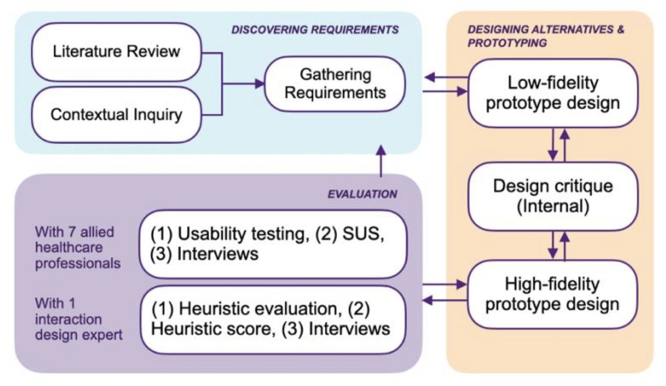
Adaptation of the Interaction Design Lifecycle Model (Rogers et al., 2002).
User Persona
01

Physiotherapists
Need to track rehabilitation patients’ progress and adjust the exercise dose to reach the desired goals.
Extremely busy, have lots of patients—challenging to remember every detail.
02

Allied healthcare professionals
Consists of engineers developing assistive technology, researchers, and doctors-nurses who are also assigned to the patient’s healthcare team.
Work alongside physiotherapists to bring the best care from all directions.
Key Findings
No. 1
Accurate repetition counting is vital for poststroke recovery, influencing exercise dose and intensity for motor function improvement in the initial three months (Bernhardt et al., 2004; Rahayu et al., 2020; Skilbeck et al., 1983). However, physiotherapists often overestimate therapy time and patient engagement. PhysiCam (software) aims to address this gap (Kaur et al., 2013).
No. 2
Data must be “processed, organized, and presented in a suitable format” (Mazza, 2009, pp. 9) for relevance and clarity. Card et al. (1999) state that visual elements improve comprehension of new information. Thus, a data visualization feature in the dashboard can enhance interpretability and reduce cognitive strain for physiotherapists.
No. 3
Information visualization in eHealth offers benefits like faster disease diagnosis, improved healthcare performance, better error detection, and easier data comprehension (Abudiyab and Alanazi, 2022).
Design
User flow


Wireframe
I opted to bring mid-fidelity prototype, a version that provides more clarity than wireframes but has fewer details that high-fidelity mockup. The reason behind this choice is to provide more context to the non-design stakeholders, rather than showing random pie charts or meaningless diagrams.

Planning User Flow
User Testing
Method
Usability testing, System Usability Scale (SUS), semi-structured interview, heuristic evaluation.
Participants
7 allied healthcare professionals in Brisbane, Australia; 1 interaction design expert.

Note: I am cutting a significant amount of details from this project showcase to respect PhysiCam team and UQ NRM lab, as PhysiCam is still undergoing development 😊
What’s Good
The usability testing reached a complete success rate of 100%.
Qualitative evaluation reveals strengths and areas for improvement in design. Major strengths: (1) clarity of data visualisations, (2) consistency in visual design style.
Quantitative evaluation scores implies good usability with minor issues (SUS score: 79.64/100; heuristic score: 4.3/5).
85.71% of allied healthcare professionals (1) Indicated they would integrate the dashboard into their workflow and (2) believed it would enhance their productivity.
Concerns
Major usability issues are identified in the main page layout, where excessive information is displayed simultaneously, complicating user interaction.
Missing labels, like captions for the x and y axes, lead to confusion.
Final Design
Note: I'm removing many design details from this mockup showcase since PhysiCam software is still being developed, and I want to respect the team 🙂 Here, I show only the two main screens of the project. For the video preview of the prototype, refer to the 'Preview' section above.
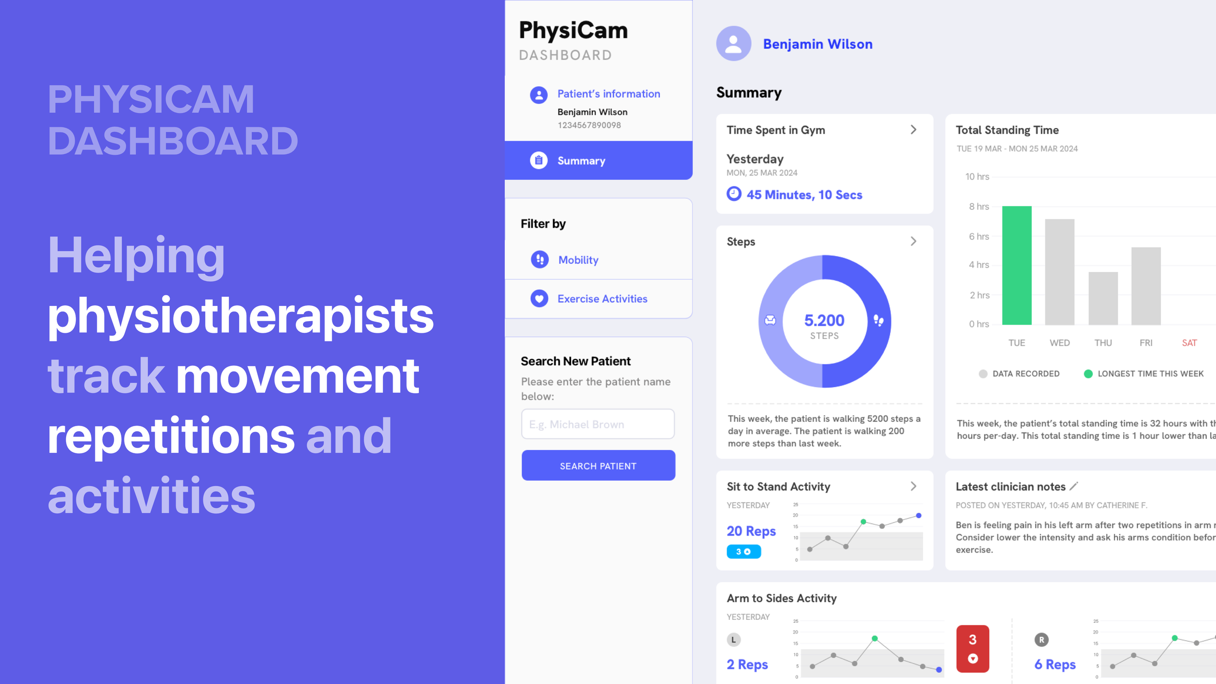
One-page summary:
get all insights in a go
Previews the latest data of the patient across data points.
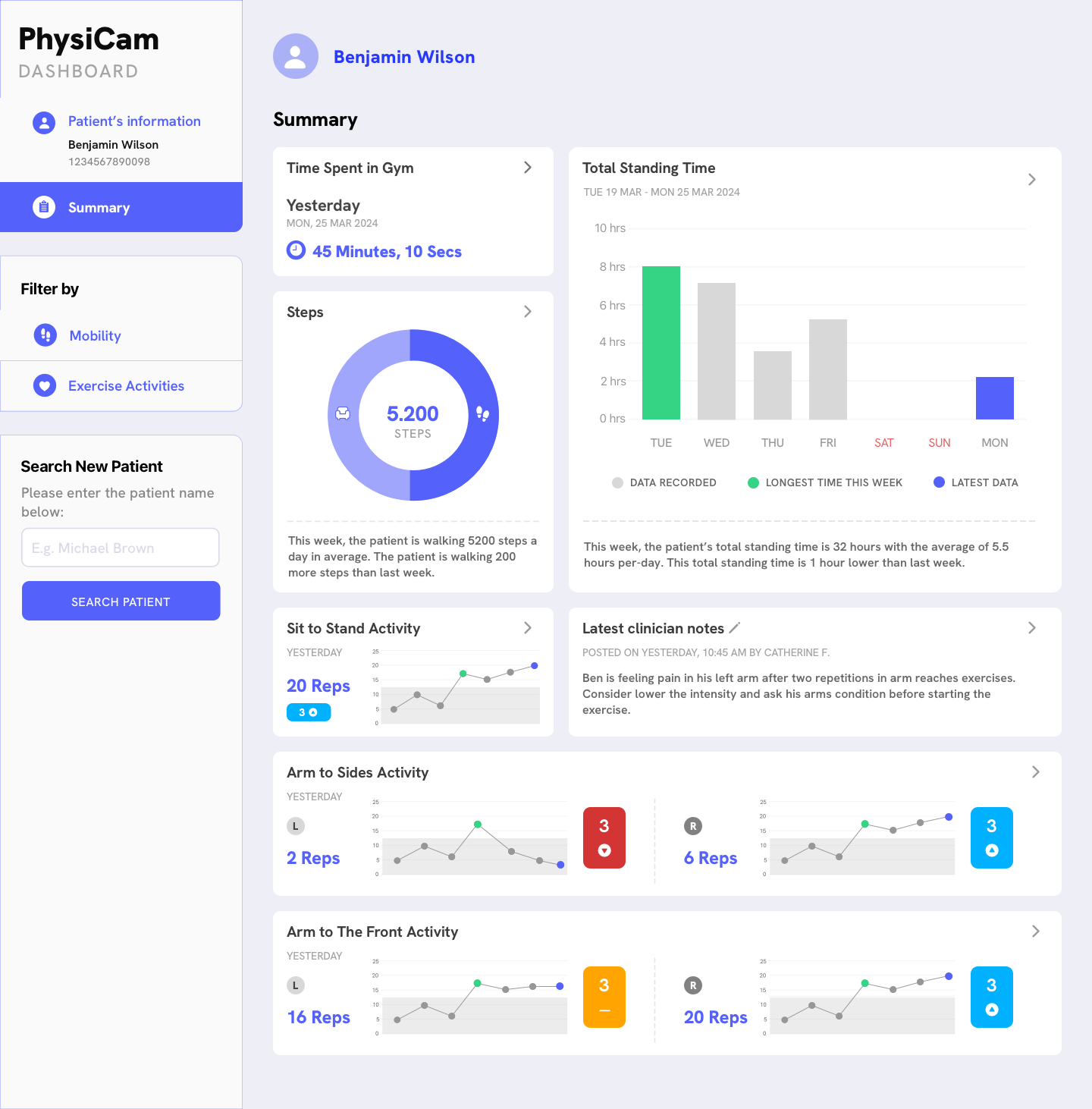
Detailed information of data points
Get more details by clicking a desired data point and more information will be displayed.

Key takeaways
Data visualisations help reduce cognitive load when reading and understanding the data. The physiotherapists and allied healthcare professionals loved the design and can understand the intentions behind every visualisation.
If i get more time to do this project, I will definitely try improving the clarity of the data visualisations, such as adding the missing labels, simplifying the main screens, and perhaps adding interactivity to provide more information when hovered, etc.
References
Abudiyab, N.A., Alanazi, A.T., 2022. Visualization Techniques in Healthcare Applications: A Narrative Review. Cureus 14, e31355. https://doi.org/10.7759/cureus.31355
Bernhardt, J., Dewey, H., Thrift, A., Donnan, G., 2004. Inactive and Alone: Physical Activity Within the First 14 Days of Acute Stroke Unit Care. Stroke 35, 1005–1009. https://doi.org/10.1161/01.STR.0000120727.40792.40
Card, S.K., Mackinlay, J.D., Shneiderman, B., 1999. Readings in information visualization :using vision to think, Information visualization. Morgan Kaufmann Publishers, San Francisco, CA, USA.
Kaur, G., English, C., Hillier, S., 2013. Physiotherapists systematically overestimate the amount of time stroke survivors spend engaged in active therapy rehabilitation: an observational study. Journal of Physiotherapy 59, 45–51. https://doi.org/10.1016/S18369553(13)70146-2
Mazza, R., 2009. Introduction to Information Visualization, 1st ed. Springer Nature, London. https://doi.org/10.1007/978-1-84800-219-7
Rahayu, U.B., Wibowo, S., Setyopranoto, I., Hibatullah Romli, M., 2020. Effectiveness of 35 physiotherapy interventions in brain plasticity, balance and functional ability in stroke survivors: A randomized controlled trial. NEUROREHABILITATION 47, 463–470. https://doi.org/10.3233/NRE-203210
Skilbeck, C.E., Wade, D.T., Hewer, R.L., Wood, V.A., 1983. Recovery after stroke. Journal of Neurology, Neurosurgery, and Psychiatry 46, 5–8. https://doi.org/10.1136/jnnp.46.1.5
Smith, M., Spurway, A., Kaasen, A., Myklebust, L.S., Donovan, J., Shirota, C., MelendezCalderon, A., 2022. Quantifying physical therapy with a video-based, easy-to-use tool.