
GrocerEase Mobile App
Helping budget-conscious students to avoid impulsivity and overspending during a grocery shopping trip by scanning the price tag using OCR to compile the products and automatically calculate the estimate total price.
Problem
Budget-conscious individuals, including students or people with lower incomes, frequently spend too much money when shopping for groceries. The main issue is that they don't know how much they've spent until they're about to pay, which can cause financial stress and make it hard to manage their budget. This points to the need for a solution that lets students track and manage their spending as they shop.
Specification
Year: 2024
Duration: 2 weeks
Team: 2 designers
Role: Idea creator, product designer
Tools
Figma, Sketch, Balsamiq, Miro
My Role
As a part of the team in the UQ Ventures Curiosity program, I was the team lead that conceptualised the GrocerEase idea and was involved in the end-to-end process, including user research, UX flow, and the design.
Preview


Introduction
Objective
The objective of the research is to validate our hypothesis: people are overestimating their shopping cart total and end up paying more than their budget in the cashier. This hypothesis is coming from our experiences, as well as the people around us, who often impulse buy things in the supermarket that lead to overspending.
Process
Design Thinking method is utilised as a framework. Since UQ Ventures Curiosity only focuses on idea validation (2 weeks for the whole process), the project is only went through a single iteration.

Image source: Rural Handmade
User Archetypes
01

impulsive students
College students with tight budgets survive by using monthly scholarship/allowance money.
Buying things on impulse because of marketing or difficulty sticking to a budget.
02

Busy single mothers
Single mothers with a child, low-income with heavy expenses in baby supplies.
While shopping, they struggle to hold their bag, watch their child, and look at products.
One common characteristic between the target users is:
They are not good with math
Key Findings
Desktop Research
No. 1
People overspend 39% from their allocated groceries shopping budget, emphasize a significant challenge to stick on their budget (Drive Research, 2024).
No. 2
Studies found the main cause of impulsive shopping is a combination of internal and external factors, such as triggered by poor self-control, the allure of marketing cues, or shopping companions (Rook and Fisher, 1995; Lim and Yazdanifard, 2015; Baumeister, 2002).
No. 3
Shopping companions contributes to a person’s shopping behaviour, including impulse purchase decisions (Chen et al., 2020).
Primary Research: Quick and Dirty
Quick research was done during the workshop. My partner and I conducted a guerrilla interview with UQ student friends, targeting college students mindful of their grocery budget.
No. 4
We talked to three UQ students and one employee living alone. All 4/4 users agreed that they were often ‘lured’ to buy something impulsively while shopping through the supermarket aisles and ended up over budget. While three of them agreed that they often overestimated the total amount of money they have to pay until they are in the cashier.
Synthesis
Both desktop and primary research show evidence of the shared experience of overestimation and challenges to sticking to their grocery budget. Therefore, our hypothesis was proven ✅
Next, we asked the possible questions:
How might we help people easily calculate how much their shopping basket will cost before they scan it at the cashier?
How might we calculate without the need of typing?
Design
Image order: User flow - Empathy Map - VPC - BMC
User flow created by me. The rest is in collaboration with my partner.


Where the solution fits
While there are so much apps out there about budgeting, grocery list, etc., we found that those apps are tackling the issues before the trip - not during one (see imagebelow).

Wireframe

Planning User Flow

This is the version 2 UI mockup, designed entirely by me, which serves as an update to the original design created by my partner in the demo video)
User Testing
Method
Concept testing
The goal is to test whether users think the app concept will help stop them from overspending after they need to pay at the cashier.
Participants
College students, Judges
Due to limited time, the test was done fairly quickly to gather preliminary feedback rather than nothing at all.

What’s Good
A very simple yet relatable idea that helps a very specific issue during shopping.
The usage of OCR makes the calculation easy without the need to do any typing, perfect for people with lots of belongings (ie. mothers).
Concerns
Different currencies might have different formats. There might be UI issues when used for foreign currency with longer nominals (ie. Rp1.000.000)
Final Design
Create new trip
The app automatically generated a trip name for you based on the date and time of the day, so you don’t have to waste time being creative on this part. Still, if you have a particular name for the trip, users can change it to whatever they like.
Users need to create a budget for the app to compare their current cart with it.

Scan and calculate

When the camera successfully detected the price tag, the app will parse it into text such as item name and price. Otherwise, it will be empty and the image border will be grayed.

Users can adjust the item quantity by using a stepper (+/-) or manually typing it. As this field is only accepting numbers, the iOS numerical keyboard will appear.
Adding items to the cart

When a scanned item is successfully added to the cart, a floating notification bar is shown near the “add to cart” button. This design choice is better than pop-up / overlay as it won’t cover the content and delay user’s action.

Counter on the top-left will also be adjusted with the added quantity.
Cart

✅ The floating bar summarise on top when user spend below or on the budget.

⚠️ If they exceed the budget, a warning will appear with the overage amount.

✏️ User can edit the cart: deleting the item or reducing the quantity after they return them to the aisles.
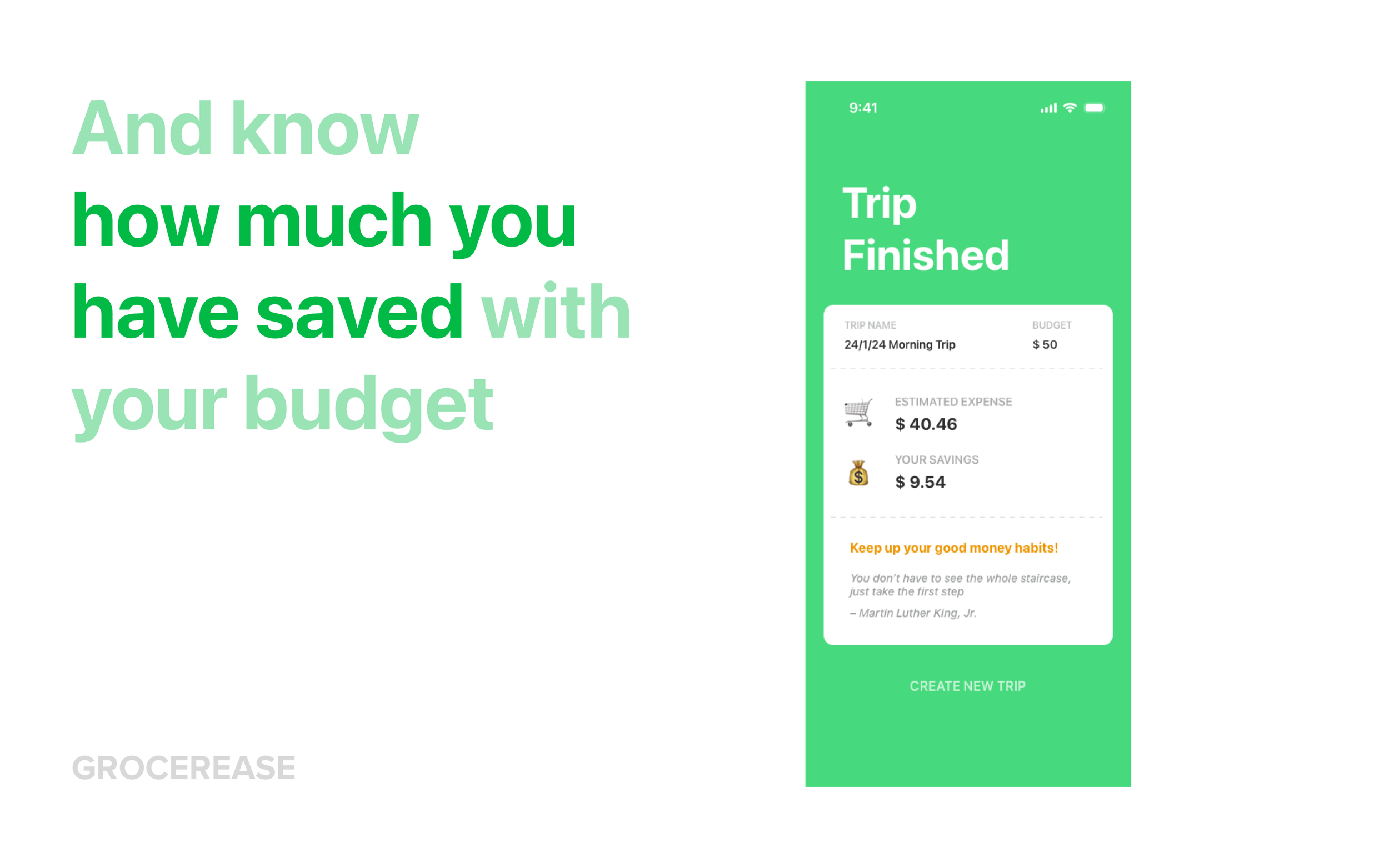
End of trip summary

This page summarises the essential information of the shopping trip. User can easily compare their budget versus the estimated expense when they are going to pay at the cashier.
Showing “your savings” is hoped to motivate users to continue their good habit by showing the money they saved by spending even lower than the setup budget.
Key Takeaways
The UI mockup shown here is the second version, fully designed by me. This is an update to the first version where the mockup was fully designed by my partner.
From this case, I learned that when designing an app, we need to understand the context where and how the user is going to use it: are they going to juggle between bags, a basket, and their child? How about the emotional state when they are exploring the item’s ingredients or price tag? It is important to not assume that an app will be used in a stationary or calm state.
Therefore, a simple and to-the-point design is crucial.
Once again, thank you to UQ Ventures team and judges Jack Qin, Shane Chidgzey, and Theia Gabatan for your invaluable knowledge and support to all of us in this cohort.